Introduction
The purpose of the climate extremes maps is to highlight the occurrence of remarkably wet, cold or hot days in the Australian climate record. Weather and climate extremes can have significant social, environmental and economic costs, with heat waves and floods prime examples. One of the greatest impacts of climate variability and climate change occurs through changes in the frequency and severity of extreme events. The climate extremes maps provide a better basis for monitoring such changes, so that we will be better able to understand, prepare for and adapt to future changes in extreme events.
Interpreting the percentile maps
The percentile maps show areas of the country that have experienced extremely hot, cold, or wet conditions on the day you select. In other words, the maps show areas of Australia where temperature or rainfall records were either broken or nearly broken on a particular day. The maps are based on a percentile analysis using all the days on record for the month in question.
The colour of the shading on the maps show how extreme the rainfall or temperature on a particular day was when compared with all the rainfall and temperature daily observations on record for that month. The Bureau's record starts in 1911 for temperature and 1900 for rainfall. For example, the rainfall percentiles for 8 June 2010 are calculated by comparing the rainfall on 8 June 2010 against the rainfall for all June days between 1 June 1900 and 8 June 2010. The observations for all the days in that month are ranked from coolest to hottest for temperature and driest to wettest for rainfall and then broken into 100 equal groups. The first group is the 1st percentile, the second group the 2nd percentile and so on. The 0th and 100th percentiles are the lowest and highest on record daily values for those calendar months. The 97th percentile value is approximately a once-a-month high value, while the 3rd percentile amounts to approximately and once-a-month low value.
It is important to note that rainfall or temperature data for days after the nominated date are not included in the calculation of percentiles for that nominated date. For example, if a new record is set on two consecutive days at a particular location, both percentile maps will show highest on record contouring.
Example percentile map
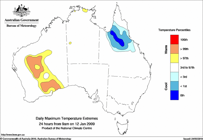
The percentile map shown below is for Maximum Temperature for the 24 hours from 9 am on 12 January 2009. The orange region in Western Australia indicates that on this day, near record high maximum temperatures for the month of January were experienced in these locations. In contrast, the dark blue region in northern Queensland indicates an area where record low maximum temperatures were observed; temperatures that low had never been recorded before in these locations during the month of January. Any area not coloured on the map experienced normal or typical conditions on this day, so nothing extreme or unusual.

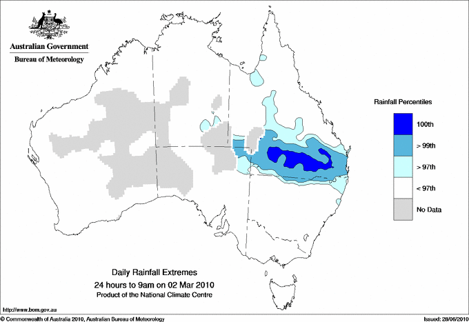
The next map is for Daily Rainfall for the 24 hours to 9 am on 2 March 2010. The map shows record breaking (100th percentile) and near record (99th and 97th percentile) rainfall for March. This heavy rainfall caused widespread flooding across much of southern Queensland.

Interpreting the average recurrence interval maps
Average recurrence interval maps highlight any areas of the country that have experienced extremely hot, cold or wet conditions on the day you select. The maps shows the extreme rainfall or temperature event in terms of the average amount of time in years that one would expect such an event to occur again, based on the past climate record and assuming no change in the future climate. In other words, the colour of the shading on the map shows how rare the extreme temperature or rainfall event is, when compared to the climate record.
While it is true that a greater than 30 year event will occur, on average, less than once every 30 years, this does not mean that there will not be another event for 30 years. In fact it is quite possible that such an event may occur twice or even more in a thirty year period. Conversely, it is possible that a once in thirty year event may not occur within a thirty year period at all.
The information on daily rainfall average recurrence intervals should not be used for hydrologic studies (including design of structures like culverts, bridges etc.), assessing the rarity of rainfall events for legal proceedings (insurance claims) and similar such applications. Instead design rainfall estimates should be used in these cases.
Average recurrence intervals are calculated by comparing the rainfall and temperature observations on the date you select with all the rainfall and temperature data for that month in the climate record. For example, if you select average recurrence intervals for rainfall on 8 June 2010, the rainfall observations on that day are compared with all rainfall observations for June between 1 June 1900 and 8 June 2010. The calculation uses data from 1911 to present for temperature and 1900 to present for rainfall. Like the percentile maps, rainfall or temperature data for days after the nominated date are not included in the calculation of percentiles for that nominated date.
Example average recurrence interval maps
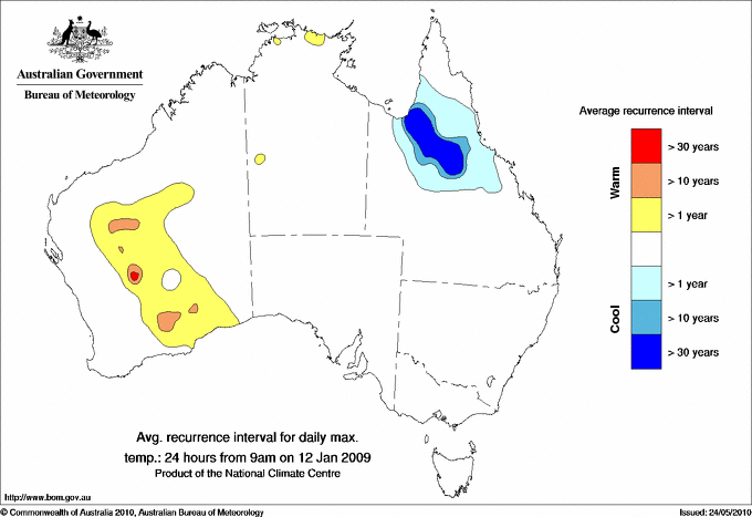
The map shown below is for Maximum Temperature for the 24 hours from 9 am on 12 January 2009. The yellow to red coloured areas refer to extremely high maximum temperatures, and the blue shades to extremely low maximum temperatures. The red region in Western Australia and the dark blue region in northern Queensland indicate that the maximum temperatures observed in these regions have an average recurrence interval of greater than 30 years. This means that in the past, maximum temperatures that hot in WA in January, and that cold in northern Queensland in January, have only occurred on average at an interval of more than 30 years in the past - so a very rare event. The orange and blue regions indicate areas that have observed maximum temperatures with average recurrence intervals greater than 10 years (a rare event), while the yellow and light blue regions indicate areas that have observed mean temperatures with average recurrence intervals greater than one year (the type of event that happens occasionally). The areas not coloured on the map have experienced normal or typical conditions - so nothing extreme or unusual.

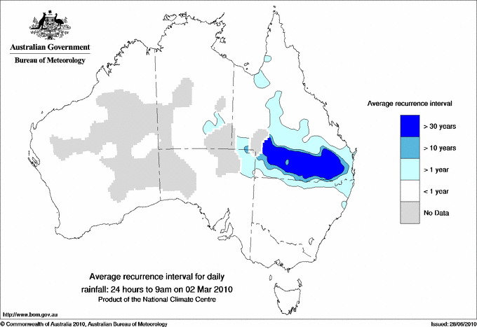
The next map is for Daily Rainfall for the 24 hours to 9 am on 2 March 2010. The dark blue region in southern Queensland indicates that the rainfall recorded during this 24 hours was so heavy and unusual that, on average you would not expect to see such an event occur again in March for more than 30 years, based on the past climate in this region. In fact, on this day, much of southern Queensland recorded rainfall that was the highest on record for January, which made the event a 1 in 110 year event for rainfall in January, based on historic records for rainfall in January. This event caused widespread flooding across much of southern Queensland.
The aqua regions on the map indicate areas that have recorded daily rainfall totals that correspond to an average recurrence interval of greater than 10 years and the light blue regions, an average recurrence interval of greater than one year. The grey shaded areas indicate data sparse regions of the network and the areas not coloured indicate that normal or typical conditions were recorded at these locations - so nothing extreme or unusual

It is important to note when using the average recurrence interval maps on this webpage, that the intervals are calculated based on the past climate record and assume no change in the future climate.
Data
These maps are generated from the Australian Water Availability Project 0.25° (25 km x 25 km) resolution daily analyses. The analyses are computer generated using a sophisticated analysis technique. Further information about the analyses can be found at http://www.bom.gov.au/jsp/awap/.
The analysis technique used to generate the maps provides an objective average for each 25 km x 25 km grid square and enables useful estimates in data-sparse areas such as central Australia. However, in data-rich areas such as southeast Australia or in regions with strong gradients, "data smoothing" will occur resulting in gridpoint values that may differ slightly from the exact rainfall or maximum and minimum temperature percentiles or average recurrence intervals measured by the contributing stations.
The calculation uses data from 1911 to present for temperature and 1900 to present for rainfall. The record for rainfall starts in 1900 because rainfall observations are insufficiently widespread before that date for a national analysis to be undertaken. The record for temperature starts in 1911 because that represents (approximately) the point at which temperature observations consistent with current observational practice (for example, with thermometers in Stevenson Screens) became sufficiently widespread for a national analysis to be undertaken.


