Page changes
This page has been updated to provide higher resolution map views and additional mapped information
- Map viewer:The map viewer allows zooming to help see details, including streamflow, water storage and groundwater sites.
It also provides a range of area boundaries to help locate relevant information.
Use the slider to adjust the opacity of map layers when you need to see more background detail.
All map controls have tooltips.
Please note that the map viewer does not support selecting location information, other than water data sites. -
Maps:
New maps include Rainfall deficiency long-range forecasts and a range of Moisture loss maps.
Please ensure that you understand probability-based long-range forecasts and their limitations. -
Sites: Select Streamflow, Water storages and Groundwater sites for mapped, clickable site details, or view site data in a table.
Groundwater sites across Australia have varied reporting frequencies, and are included if they have reported in the latest available month. - About: Information about each type of map and site data is available below the map viewer.
-
Downloadable maps and rainfall deficiency data for described periods remain available from the Archive versions, linked below the text section.
These versions are also the best format for slower internet connections.
Please help improve this page Tell us what is valuable, and what needs further work, or adding. Thank you
Rainfall deficiencies
Soil moisture
Moisture loss
Negative ESI values can indicate vegetation moisture stress reflecting agricultural and ecological drought. A rapid decrease in ESI values can be an indicator of flash drought.
Streamflow
Water storages
Groundwater
Weather patterns and trends
About the maps and data
Rainfall maps
Rainfall maps
Monthly rainfall totals, deciles and deficiency analysis maps use the AGCD v2 dataset. The gridded analysis uses monthly rainfall data from up to around 5000 sites across Australia.
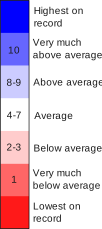
Decile maps show how the latest values for a given period compare with historical values for the same period from the full record (since 1900). Deciles rank data into 10 equal parts.
Decile maps show if an observation is:
- Average (middle decile bands 4–7)
- Below average (decile bands 2–3)
- Very much below average (decile band 1)
- Above average (decile bands 8–9)
- Very much above average (decile band 10)
The extreme ends of the distribution are the lowest on record and highest on record, and each can also be considered within decile bands 1 and 10 respectively.
Rainfall totals
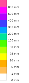
The monthly rainfall totals map shows rainfall totals for the month in millimetres from 1 mm to greater than 800 mm.
It can be useful to check actual rainfall as rainfall relative to the historical record might give an incomplete picture. For example, in northern Australian regions during the dry season, rainfall is typically very low and so small differences can lead to large ranking changes. Additionally, in this scenario, above average rainfall rankings can still correspond to low rainfall amounts. This is also the case in areas that typically have high rainfall, where a drier than average ranking can still correspond to high rainfall totals.
30-year rainfall trend maps
Each rainfall decile map in the 'Last 30 years of rainfall' section is based on observations from respective periods between 1900 to the end of the latest complete year, or complete season. The 'Southern cool season' is from April to October and the 'Northern wet season' is from October to April.
Rainfall deficiencies
Rainfall deficiencies
The rainfall deficiency analysis maps show how the latest observations for a particular period compare to historical values for the same period from the full history of record (since 1900).
These rainfall deficiency maps are produced at the end of each month. 'History to now' rainfall maps are updated during the month to capture later data, so can differ slightly.
The deficiency maps focus on values that are well below average and use percentiles to show this. Percentiles rank data into 100 equal parts, which is useful for identifying extreme values, like those in the bottom 5% of the historical totals.
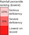
The colours in the deficiency maps represent:
- Serious deficiency - rainfall in the lowest 5–10% of historical totals.
- Severe deficiency - rainfall in the lowest 5% of historical totals.
- Lowest on record - lowest since at least 1900 when the data analysed begin.
Deficiency forecasts
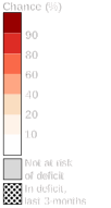
The deficiency forecast maps show the likelihood of an area being in a serious or severe rainfall deficiency (i.e. rainfall in the lowest 10% of historical totals) at the end of the 1-month and 3-month forecast period, taking into account the latest observed 3 months, or 6 months of rainfall.
Black stipples on the maps show existing deficiency areas based on the latest observed 3-month or 6-month periods so you can compare the extent of existing areas with the coloured forecast areas.
The colours on the deficiency forecast maps indicate the probability of a rainfall deficiency occurring at the end of the forecast period while the colours on the rainfall deficiency analysis maps indicate the presence and severity of observed deficiencies.
The forecast maps use calibrated ACCESS-S data for the forecasts (the same data used for the 'chance of extremes' long-range forecasts), and AGCD v2 data for the observations. The same historical record of the rainfall deficiency analysis maps is used (i.e. since 1900).
Soil moisture
Soil moisture
The maps provide soil moisture information for the last day of the calendar month, using daily data. Data is from the AWRA-L model.
Root zone soil moisture is the modelled percentage of plant available water content in the top 1 m of the soil profile. Deep layer soil moisture is the modelled percentage of available water content between 1 m and 6 m in the soil profile.
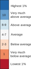
The soil moisture decile maps show the latest daily soil moisture compared to historical values for the same day of the year over a historical reference period of 1911–2017.
Deciles rank data into 10 equal parts. Decile maps show if an observation is average (middle decile bands 4–7), below average (decile bands 2–3), very much below average (decile band 1), above average (decile bands 8–9) or very much above average (decile band 10).
The extreme ends of the soil moisture distribution are the lowest 1% or highest 1%, and each can also be considered within decile bands 1 and 10 respectively.
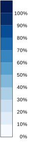
Absolute soil moisture values represent the percentage (%) of available water content relative to the total soil water holding capacity.
Moisture loss
Evaporative stress
The Evaporative Stress Index (ESI) map is linked from the 'Moisture loss' text section.
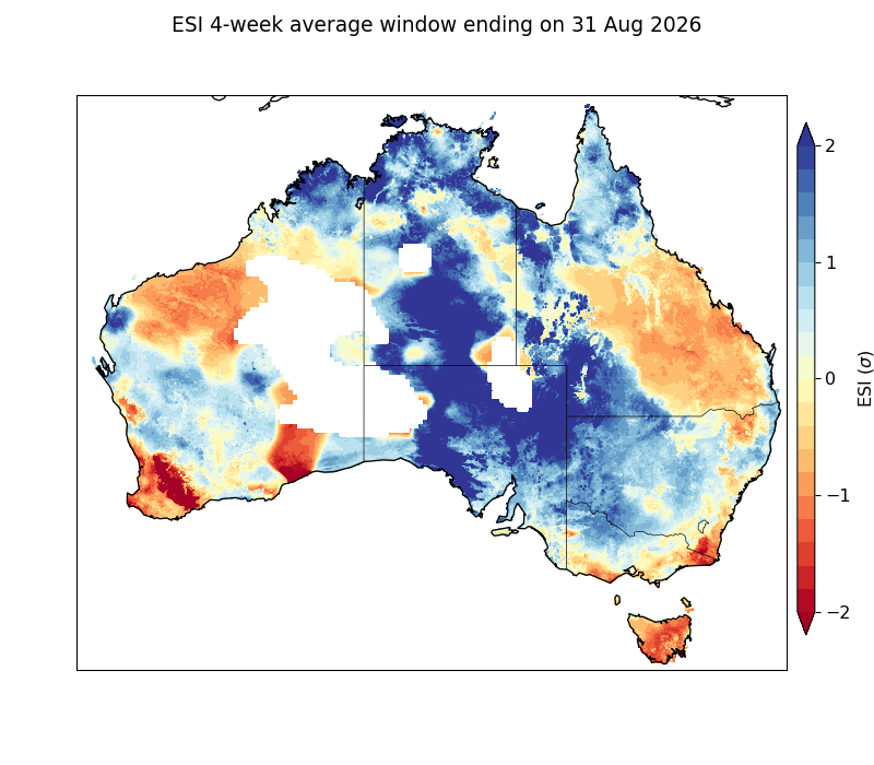
The ESI map shows the average ESI index value during the 4 weeks to the listed date (near the end of the month).
ESI provides an indication of vegetation moisture stress and how plants are responding to available water. It is calculated using information including rainfall, temperature, humidity, wind speed, solar radiation and land surface characteristics. Negative ESI values indicate increasing plant stress, with values below −1 potentially indicating drought conditions. ESI generally follows rainfall patterns, although high temperatures can increase plant stress, particularly during warmer seasons. Rapid decreases in ESI may also signal the onset of flash drought, which occurs when drought conditions develop or intensify over a period of weeks.
ESI closely follows rainfall patterns, but temperature only has a strong effect in warmer seasons, suggesting heat increases plant stress once temperatures pass a certain level.
Evapotranspiration
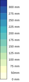
The evapotranspiration and potential evapotranspiration maps use monthly averaged modelled data. Totals are measured in millimetres (mm). The decile maps compare the latest monthly values to historical values for the same month from a historical reference period of 1911–2017.
Evapotranspiration
The evapotranspiration maps show a modelled estimate (mm) of the total amount of water evaporated and transpired from vegetation, soil and groundwater in the month. The actual evapotranspiration is limited by the potential evapotranspiration rate and water status of the landscape. The evapotranspiration decile maps compare the latest monthly values to historical values for the same month over a historical reference period of 1911–2017.
Potential evapotranspiration
Potential evapotranspiration for the month is calculated from data including satellite-based downward solar irradiance, maximum and minimum air temperature. Potential evapotranspiration provides an upper limit on evaporation and transpiration processes from the soil and vegetation and depends only on the available energy at the surface.
AWO decile maps compare the latest monthly values to historical values for the same month over a historical reference period of 1911–2017.
Effective rainfall
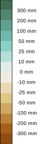
Effective rainfall uses total monthly rainfall and total monthly actual evapotranspiration data. Effective rainfall shows rainfall for the month after evapotranspiration losses have been subtracted. Effective rainfall totals are shown in millimetres (mm). Positive values (green) are for areas where rainfall exceeded actual evaporation for the month (generally leading to increases in soil moisture), and negative values (brown) are for areas where actual evapotranspiration exceeded rainfall.
Relative effective rainfall
Relative effective rainfall shows effective rainfall as a decile rank, comparing the latest monthly value to historical values from the same month over a historical reference period of 1911–2017.
Maximum and minimum temperature deciles

The maximum and minimum temperature maps use monthly data (temperature averaged over the month) from the AGCD v1 dataset. The decile maps show the latest monthly averages, compared to historical values for the same month over a historical reference period of 1911–2017.
Warm temperatures increase moisture losses from the landscape and vegetation. In dry areas, high temperatures can trigger vegetation death from drought shock.
Streamflow
Streamflow
Streamflow status is from end of the month data.
Streamflow gauging station sites have been selected to best represent flows across Australia's 13 drainage divisions.

The streamflow is the amount of water flowing in a river, stream or channel at a specific location and period of time. Maximum streamflow is the highest recorded flow value during the month. Minimum streamflow is the lowest recorded flow value during the month. Mean streamflow is the average of all streamflow values over the month.
Streamflow site data can be viewed in the map or table.
Select site dots on the map, to view details including the station name and ID and the total monthly streamflow volume. Site dot colours show the decile ranking of the latest monthly values compared with historical values from the same month since 1975.
The table view supports sorting and filtering of sites. Select the row to show the site details in the map view, or select the 'site id' to link to site timeseries charts. NOTE: some sites do not have available timeseries charts.
Water storages
Water storages
Storage levels are from end of the month data.
More than 300 publicly owned lakes, reservoirs and weirs have been included.
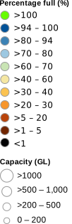
Storages site data can be viewed via the map or table.
Select site dots on the map, to view details including the Storage name, capacity, accessible volume, total volume, water system, percentage change from previous month and previous year.
Dot sizes indicate storage capacity and the colours show the storage levels at end of month.
The table view supports sorting and filtering of sites. Select the row to show the site details in the map view, or select the 'site id' to link to site timeseries charts.
Accessible storage capacity (GL) values represent the sum of this capacity that is reported for a collection of water storages.
Accessible storage volume (GL) represents the volume of water stored at end of the reporting month.
Percent full (% full) represent the volume of water in storage as a percentage of the accessible storage capacity at end of the reporting month.
The total storage capacity (GL) and volume (GL) is based on values reported at the end of the month.
Perth relies heavily on desalination and groundwater, with long-term declines in surface water inflows into its storages.
Adelaide supplements its urban water supply with River Murray transfers, supported by desalination and groundwater.
Groundwater
Groundwater
Bore level Status is derived using data from available bores (more than 870,000 bores) across Australia.
Bore level reporting frequencies vary from daily for some bores, to monthly or less frequent measurements, so sites shown on the map will vary.
The mean depth to water level is the average of all recorded depth to water level measurements at that bore, over the month.
The groundwater level status is based on the most recent measurement for each bore, which may not be from the end of the month.
Groundwater details can be viewed via the map or table including Water level status, Depth to water, Historical depths, Minimum, Mean, Maximum, Water level trends over the last 5, 10 and 20 years.
Map dot colours show the groundwater level status. Select dots for bore levels and details.
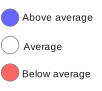
The groundwater level status compares the most recent measurement to historical data for that bore, to show it as 'Below average', 'Average', or 'Above average' based on its decile ranking within the historical record since 1997–98.
The deciles are categorised as:
- Below average (decile bands 1–3)
- Average (middle decile bands 4–7)
- Above average (decile bands 8–10)
Further information
Related Bureau pages
Data
Rainfall and water information
- Australian Water Outlook
- Month, season, annual and financial year summaries
- Latest rainfall totals
- Rainfall maps - history to now
- Water Data Online
- Water storage dashboard
- Streamflow seasonal forecasts, 7-day streamflow forecasts
- Groundwater Insight
- Hydrologic reference stations
- State of the Climate (summary of trends and change)
- Technical information about the deficiency forecasts
- Technical information about the Evaporative Stress Index (ESI)
- Australian climate classification maps
Global drought monitoring
Global monitoring
Drought history in Australia
Drought history in Australia
- Month, season, annual and financial year summaries
- Drought Statement archive (since 2000)
- Special climate statements
- The Millenium drought
- Southern rainfall decline in Australia
- The Millennium Drought in South Australia
- Rainfall maps - history to now
- Rainfall history poster
- Australia's tinderbox drought 2017-2019
- Rainfall trends in Australia
Water agencies
National Water Agencies
- Murray–Darling Basin Authority
- Department of Climate Change, Energy, the Environment and Water
- Commonwealth Environmental Water Holder
- CSIRO – Water
State Agencies
Agriculture services and information
National information and services
- Drought, disaster and rural support (DAFF)
-
My Climate View (Application)
Location‑ and commodity‑specific climate history, seasonal outlooks and 50‑year climate projections for farm decision‑making. - Australian Government Drought Plan (2024)
- ABARES: Ground cover monitoring
- ABARES: Australian Agricultural Drought Indicators (AADI)
- Northern Australia Climate Program: Drought monitoring
- Drought Situation | LongPaddock | Queensland Government
- Drought in New South Wales
- NSW: Interactive drought map
- Western Australia Climate and Weather
- Victoria: Drought programs and policy
- South Australia Drought Support
- South Australia Drought Hub
- Tasmania: Drought factor map
- Tasmanian Seasonal Conditions
Regional drought information
Drought risk planning
Drought risk planning
Climate change information
Climate change tracking and projections
Drought research
Drought research (Australia)
-
How unusual was Australia’s 2017–2019 Tinderbox Drought?
Falster, G., Coats, S. and Abram, N. (2024). Weather and Climate Extremes, 46, p.100734.
DOI: 10.1016/j.wace.2024.100734 -
The role of anthropogenic forcing on Australia's Tinderbox (2017–19) drought and its future likelihood
S Rauniyar, S Power, P Hope, U Bende-Michl (2024) – EGU General Assembly Abstracts
DOI: 10.5194/egusphere-egu24-8892 -
Seasonality in atmospheric circulation patterns leading to wet and dry seasons in southeast Australia and implications for droughts.
Rudeva, I. (2025). Weather and Climate Extremes, 48, p.100750.
DOI: 10.1016/j.wace.2025.100750 -
Anthropogenic warming reduces the likelihood of drought-breaking extreme rainfall events in southeast Australia.
Holgate, C.M., Pepler, A., Rudeva, I. and Abram, N. (2023). Weather and Climate
DOI: 10.1016/j.wace.2023.100607 -
The role of internal variability and external forcing on southwestern Australian rainfall: prospects for very wet or dry years
SP Rauniyar, P Hope, SB Power, et al. (2023) – Scientific Reports
DOI: 10.1126/sciadv.adj3460 -
Can southern Australian rainfall decline be explained? A review of possible drivers
RC McKay, G Boschat, I Rudeva, et al. (2023) – Wiley Interdisciplinary Reviews: Climate Change
DOI: 10.1002/wcc.820 -
Physical mechanisms of meteorological drought development, intensification and termination: an Australian review
CM Holgate, GM Falster, ZE Gillett, et al. (2025) – Communications Earth & Environment
DOI: 10.1038/s43247-025-02179-3 -
Past and future rainfall change in sub-regions of Victoria, Australia
SP Rauniyar, SB Power (2023) – Climatic Change
DOI: 10.1007/s10584-023-03562-9 -
Estimating future rainfall distributions in a changing climate for water resource planning: Victoria, Australia
SP Rauniyar, SB Power – Climate Dynamics
DOI: 10.1007/s00382-022-06330-0 -
Approaches to understanding decadal and long-term shifts in observed precipitation distributions in Victoria, Australia
G Tolhurst, P Hope, L Osburn, S Rauniyar (2023) – Journal of Applied Meteorology and Climatology
DOI:10.1175/JAMC-D-22-0031.1
Rainfall deficiencies and water availability at the end of August
- August rainfall was above average in central and inland areas, but below average in Tasmania, parts of the west and south-east coasts, and large areas in eastern Queensland.
- Long-range forecasts for 4-month rainfall deficiencies to the end of September show rainfall deficiencies likely for much of eastern Queensland, parts of eastern New South Wales, eastern Victoria, south-west Western Australia, and parts of northern Australia.
- Areas with 2026-to-date rainfall deficiencies expanded in the west of Western Australia and in Tasmania, and persisted in north-eastern New South Wales and southern Queensland.
- Areas with rainfall deficiencies for the latest 24 months, expanded and intensified in the south-west of Western Australia and in Tasmania, and persisted in other south-eastern states.
- Soil moisture remained below average in parts of western and eastern Australia, declining through areas of Western Australia and Tasmania, with extensive below-average conditions persisting across Queensland.
- Evaporative stress remained elevated across parts of western and eastern Australia, increasing through much of Tasmania but easing within inland New South Wales, Victoria, and south-eastern South Australia.
- Streamflow was lower than average at many sites across southern Australia, the south-west of Western Australia, parts of eastern Australia and southern Queensland.
- Some water storages in the eastern and southern states are at or below 50% of their capacity.
- Groundwater levels were above average in northern Australia and below average across southern Australia.
High August rainfall across inland Australia, contrasting with drier coastal areas
August area-averaged rainfall totals were above average for all states and territories except for Queensland and Tasmania.
August rainfall was below average to very much below average (in the driest 10% of all Augusts since 1900) for:
- Tasmania
- parts of southern and far eastern Victoria and adjacent south-eastern New South Wales
- Western Australia's south-west and some areas in the west
- parts of eastern Queensland.
With the area-averaged rainfall 49% below average, Tasmania had its seventh-driest August on record, the driest since 1982.
August rainfall was above average to very much above average (in the wettest 10% of all Augusts since 1900) for:
- most of South Australia, northern Victoria and western and central New South Wales
- much of central and southern Western Australia
- large parts of western and south-western Queensland and pockets along the state's north-east coast
- the southern half of the Northern Territory and small areas in the Territory's far north.
South Australia had its fourth-wettest August on record and the wettest since 1992, with the area-averaged rainfall more than double the average.
Winter (3-month) rainfall
June to August rainfall was below average to very much below average (in the driest 10% of all winter periods since 1900) for:
- Western Australia's south-west and some areas in the state's north
- large parts of eastern Queensland and New South Wales
- eastern parts of Victoria and Tasmania.
June to August rainfall was above average to very much above average (in the wettest 10% of all winter periods since 1900) for:
- most of South Australia, northern Victoria and much of southern Western Australia
- much of western and central New South Wales
- large parts of western and south-western Queensland and along the state's north-east coast
- southern Northern Territory and smaller areas in the north.
Winter rainfall was the highest on record for an area spanning the border between South Australia and New South Wales. Many stations had their record highest winter total rainfall.
South Australia had its seventh-wettest winter on record, the wettest since 1978.
Multi-year (36-month) rainfall deficiencies
Rainfall for the 36 months ending in August 2026 was below average to very much below average (in the driest 10% of all September to August 36-month periods since 1900) for:
- large areas of the west and south-west of Western Australia
- south-eastern agricultural areas in South Australia
- much of Victoria
- areas along New South Wales western slopes, and into south-eastern Queensland
- Tasmania.
Long-range forecast for September to November
The long-range forecast, released on 3 September 2026 for September to November 2026 shows:
- Rainfall is likely to be below average across parts of the south and east and above average across the western half of Australia.
- Daytime temperatures are likely to be above average south of the tropics.
- Overnight temperatures are likely to be above average for most of Australia.
Rainfall deficiency forecasts
Rainfall deficiency areas are those with rainfall in the lowest 10% of record.
Deficiencies to the end of September
Long-range forecasts from our ACCESS-S model indicate that for 4-month deficiencies (1-month forecast plus 3-month existing deficiencies) ending in September 2026:
- Existing June to August deficiencies are favoured to persist during September in the south-west of Western Australia and to expand across eastern Queensland, parts of eastern New South Wales and to develop in parts of northern Australia.
Forecasts indicate that for 7-month deficiencies (1-month forecast plus 6-month existing deficiencies) ending in September 2026:
- Existing March to August deficiencies are favoured to persist during September in the south-west and to expand in areas in eastern Australia.
Deficiencies to the end of November
Forecasts indicate that for 6-month deficiencies (3-month forecast plus 3-month existing deficiencies) ending in November 2026:
- Areas with June to August deficiencies in south-west Western Australia, eastern Victoria and south-eastern New South Wales are favoured to persist during spring.
- Winter deficiency areas are favoured to ease and contract during spring in eastern Queensland and north-eastern New South Wales.
Forecast 9-month deficiencies (3-month forecast plus 6-month existing deficiencies) ending in November 2026 indicate:
- Existing March to August deficiencies are favoured to persist through spring in parts of south-west Western Australia, far-eastern Victoria and adjacent coastal New South Wales.
- March to August deficiencies have roughly an equal chance of easing or persisting in small areas of eastern Queensland, north-eastern New South Wales, and some inland parts of south-west Western Australia.
Deficiencies for the 8 months to the end of August
For the 8 months ending in August 2026, areas with severe or serious rainfall deficiencies (August rainfall totals in the lowest 5% or 10% of years, since 1900) include:
- parts of north-eastern New South Wales into south-eastern Queensland
- areas of the south-west and the Pilbara–Gascoyne region in Western Australia
- small areas in Tasmania.
During August, areas of rainfall deficiency expanded slightly and intensified in the south-west and the Pilbara–Gascoyne region in Western Australia and developed in small areas of Tasmania. Rainfall deficiency areas persisted in north-eastern New South Wales and southern Queensland.
Deficiencies for the 24 months to the end of August
For the latest 24-month period ending in August 2026, areas with severe or serious rainfall deficiencies (24-month rainfall totals in the lowest 5% or 10% of periods, since 1900) extend across parts of:
- the south-west in Western Australia
- extend across parts of South Australia's Mid North district.
- southern Victoria
- the Riverina in New South Wales
- eastern Tasmania.
Compared with the 24-month period ending in July 2026, areas of rainfall deficiency intensified and expanded in the south-west of Western Australia and eastern Tasmania and contracted in Victoria, New South Wales and South Australia.
Soil moisture was below average across parts of western and eastern Australia
During August, root-zone soil moisture declined across parts of Tasmania and Western Australia, particularly in the north-west and south-west, while below-average conditions persisted across eastern Australia.
August root-zone soil moisture (0–1 m) was below to very much below average for:
- large parts of eastern Queensland and Cape York Peninsula
- parts of coastal and north-eastern New South Wales
- parts of south-eastern Victoria
- parts of the north-west, south-west, and south of Western Australia, including isolated areas in the lowest 1%
- small areas of central-western South Australia and south-eastern Northern Territory
- parts of Tasmania.
Above-average soil moisture remained widespread across central and southern inland Australia during August, although becoming less extensive through parts of New South Wales and Victoria. Areas of very much above-average soil moisture persisted across South Australia, western New South Wales, and north-western Victoria, with isolated pockets in central inland Western Australia, the southern Northern Territory, and south-western Queensland.
Soil moisture was generally close to average elsewhere.
Evaporative stress remained elevated across parts of western and eastern Australia
During August, areas of below-average actual evapotranspiration became more extensive across parts of western and eastern Australia, particularly in Queensland, Tasmania, the north-west of Western Australia, and coastal areas of New South Wales and Victoria. Evapotranspiration was generally average to above average across much of inland Australia and the northern tropics, where it was not limited by soil moisture.
Evaporative stress for the 4 weeks ending 31 August 2026 was elevated (negative Evaporative Stress Index (ESI)) in:
- large areas of Western Australia, particularly in the north-west and south
- large areas of central and eastern Queensland
- parts of north-eastern and the south coast of New South Wales
- parts of southern, western and eastern Victoria
- much of Tasmania.
Throughout the month, evaporative stress increased across much of Tasmania and remained elevated across the west and south-west of Western Australia, central and eastern Queensland, inland parts of north-eastern New South Wales, and coastal and adjacent inland areas of New South Wales and Victoria. Evaporative stress eased across much of inland New South Wales and Victoria, as well as south-eastern South Australia, broadly corresponding with average to above-average rainfall.
Low streamflow in southern Australia, northern New South Wales and southern Queensland
Streamflow was lower than average at 28% of the 912 sites with available data across Australia in August (based on records since 1975). Very much below average streamflow (in the lowest 10% of years since 1975) was recorded in August at 8% of sites (including 1% of sites with lowest on record). Below average rainfall, particularly in the west of Western Australia, Tasmania and eastern Australia, reduced root-zone soil moisture and runoff in those catchments. Regions with lower-than-average streamflow included:
- across the North East Coast drainage division (16% of 165 sites) with 5% sites in the central east and south were very much below average. A single site in the Carpentaria Coast drainage division.
- northern and eastern areas of the Murray–Darling Basin drainage division (22% of 340 sites) with 4% sites in the north-east were very much below average.
- across the South East Coast (New South Wales) drainage division (33% of 111 sites) were below average.
- across the South East Coast (Victoria) drainage division (28% of 102 sites) with 4% sites were very much below average.
- across Tasmania (72% of 21 sites) with 29% sites in the east were very much below average.
- across the South West Coast drainage division of Western Australia (90% of 76 sites) with 49% sites were very much below average.
- in the Pilbara–Gascoyne drainage division (27% of 15 sites).
Streamflow in August was average at 44% of sites spread across the country. Higher than average streamflow was recorded at 28% of sites, with 10% of sites recording very much above average streamflow (in the highest 10% of years since 1975), mostly in northern Australia and at some sites in Southern Australia.
Low water storage levels in Victoria, the Murray–Darling Basin and central Queensland
By the end of August, total water storage across Australia (302 public storages) was at 70.9% of capacity, an increase of 1.7% from the previous month, and an increase of 2.7% from this time last year. The increase was mainly driven by winter inflows into southern Australian storages, where August is typically part of the annual filling season.
Storage volumes decreased in 141 storages during August, with 548 storages below 50% capacity at the end of the month in:
- south-eastern Queensland
- the southern and eastern Murray–Darling Basin
- Victoria
- Perth urban storages
- central parts of Tasmania.
Declines in storages over the past month across the country were associated with dry catchment conditions and reduced inflows to major storages.
North East Coast and South-eastern Australia
In the North East Coast drainage division, overall storage levels remained relatively high, ending August at 75.0% of capacity. Several storages remained below 50%, including Fairbairn Dam, Queensland’s second-largest storage, which finished the month at 28.8%—down 2.0% from last month, but up 8.6% from last year.
Overall storage volume across the Murray–Darling Basin was 67.2% at the end of August, up 6.5% from last month, but 2.0% lower than this time last year. Northern Basin increased by 1.5% during August, finishing at 57.3%, and down 21.9% since last year. Menindee Lakes in western New South Wales a slightly down 2.4% from previous month and finished at 23.4% of capacity at the end of August, and 52.6% lower than this time last year.
Urban storages
At the end of August, surface water storages supplying most capital cities were close to or above 80% of accessible capacity, except for those in Melbourne and Perth.
Perth’s surface water storages were at 39.3% of accessible capacity at the end of August, a slight increase of 1.6% from the previous month, and lower (3.7%) than at the same time last year.
Melbourne's water storages increased by 2.9% from the previous month, finishing at 69.4% capacity.
Below average groundwater levels in areas of southern and south-eastern Australia
Groundwater conditions in August showed a north-south contrast, with below average groundwater levels dominating much of southern Australia. Regions with a high proportion of lower-than-average groundwater levels included:
- the Murray–Darling Basin, particularly the southern Basin and in the Riverina
- Victoria and parts of New South Wales
- along the South Australia–Victoria border
- south-west of Western Australia including the Perth region
- Tasmania, especially northern and eastern parts of the region.
Bores with average groundwater levels were scattered across Southern Australia, parts of New South Wales, Victoria and Tasmania.
Groundwater levels were above average across northern Australia, and in scattered locations elsewhere.
Over the 5-year period to August 2026, around 26% of bores with 5-year trend showed a rising trend, mainly in northern Australia, parts of southern Murray–Darling Basin, northern New South Wales and isolated areas of Victoria, while 29% showed a declining 5-year trend were more widespread across southern Australia, reflecting the dry conditions in the south-west of Western Australia, southern Murray-Darling Basin, northern New South Wales, southern Victoria and Tasmania. Over the 10- and 20-year periods, groundwater levels were mostly stable across Australia. Persistent declining trends were observed in parts of southern Australia, while rising trends occurred in parts of the southern Murray-Darling Basin and northern New South Wales.
Recent decades
State of the Climate 2024 reported that there has been a shift towards drier conditions across southern Australia, especially for the cool season months from April to October. Even with occasional wetter seasons in some areas, southern Australia has recorded below-average April–October rainfall in 26 of the 32 years from 1994 to 2025.
The decline in southern Australia's cool season rainfall is linked to rising surface pressure and shifts in large-scale weather patterns, with more high-pressure systems and fewer rain-producing lows and cold fronts.
.
Product code: IDCKGD0AR0
 Unless otherwise noted, all maps, graphs and diagrams in this page are licensed under the Creative Commons Attribution 4.0 International Licence